Visual Branding 101: How to Design a Memorable Brand Identity
- Blog, Branding, Design, Digital Marketing
- Brand identity, Branding, Design, Design principles, Digital Marketing, Visual Branding
- August 9, 2024
In today’s world, driven by visuals, your brand’s identity becomes more than just a logo. The complete visual language reveals who you are, your values, and how you want others to see or perceive you. Visual branding either make or break your brand identity. Whether it is a start-up establishing its first brand image or an established organization aiming to reform its appearance, understanding visual branding principles is an absolute must.
1. What is Visual Branding?
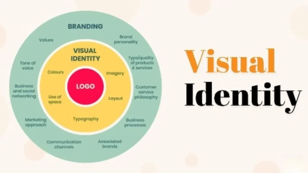
Visual branding contains all graphical features that represent your brand. It is not only concerned with having a beautiful logo but rather creating a coherent visual journey that effectively communicates the message of the brand. These consist of logos, color schemes, font styles, and pictures used in addition to generally accepted design patterns.
Key Elements of Visual Branding:
- Logo: A symbol or design that defines your brand.
- Color Palette: A set of colors used consistently across all brand materials.
- Typography: The fonts and styles of text that relate to your brand’s personality.
- Imagery: The photos, illustrations, and graphics that support your brand’s story.
- Design Style: The overall aesthetic that connects all these elements.
2. The Importance of Visual Branding
Visual branding is very important since it is usually the first point of contact with your brand by customers. This sets them up for their entire interaction and determines how they will perceive your business. Some of the benefits of a strong visual brand are:
- Build Recognition: Consistent visual branding makes your brand easily recognizable by users.
- Create Trust: A professional and cohesive visual brand creates credibility and trust with your audience.
- Differentiate Your Brand: Your visual brand sets you apart from rivals in a crowded market.
- Convey Your Message: Visual branding helps convey your brand’s values, mission, and personality to your audience.
3. Key Design Principles for Effective Visual Branding
These design principles help to create an unforgettable brand identity. They should be followed to make sure that your visual branding is visually appealing to your audience while at the same time conveying your business goals.
a. Simplicity
When it comes to visual branding, simple is better. Simple designs are easier to recognize and remember. Too much complexity can confuse people or weaken a brand’s message.
- Example: Think of brands like Apple or Nike. Their logos are simple, yet instantly recognizable by the public.
b. Consistency
Consistency is key to establishing a strong visual brand. Αll your branding should blend effortlessly together building a unified appearance and experience across all platforms.
- Tip: Use the same design principles in all brand materials, starting from your website and ending at your social media channels.
c. Relevance
For effective communication, visual branding should be relevant to one’s industry and target market. It should be coherently linked with your brand’s character and values as well as resonating with the intended audience.
- Example: A luxury brand might use elegant fonts and a refined color palette, while a children’s brand might use bright colors and playful typography.
d. Flexibility
However, this does not mean that you can’t have consistency in creative execution but there needs to be enough flexibility for different contexts. This will keep it current as trends evolve or when you expand your operations.
- Tip: Design a logo that can be used in various formats, such as on a business card, website, or billboard which can be used in different ways of advertising.
e. Emotional Appeal
It should evoke emotions that align with your brand’s message. Whether you want your brand to be seen as trustworthy, innovative, or fun, your visual elements should reinforce that perception to your audience.
- Example: A healthcare brand might use soft colors and clean, modern fonts to evoke a feeling of calm and reliability.
4. Building a Visual Branding Toolkit
Creating a strong visual brand requires the right tools and resources. There are certain conditions for building a visual branding toolkit which are:
- Logo Design Software: Tools like Adobe Illustrator or Canva for creating a professional logo.
- Color Palette Generators: Use tools like Coolors or Adobe Color to create a cohesive color scheme.
- Typography Resources: Google Fonts and Adobe Fonts offer a wide range of typefaces to match your brand’s personality.
- Image Libraries: High-quality images from sites like Unsplash, Shutterstock, or Getty Images can elevate your visual content.
- Design Templates: Canva and Adobe Spark offer customizable templates for social media, presentations, and more.
5. Case Studies: Brands with Strong Visual Identities
a. Coca-Cola

Coca-Cola’s visual branding is instantly recognizable with its distinctive red and white colors and cursive logo; this has made it one of the most prominent brands globally in terms of visual branding consistency.
b. Airbnb
Airbnb rebranded in 2014 with new colors, logos, and designs emphasizing community and belonging. This rebranding helped the company stand out in the competitive travel industry.
c. Spotify

Spotify uses vibrant green color and minimalist design to establish a modern, tech-savvy brand identity. The visual branding is consistent across all platforms, from the app interface to advertising campaigns.
6. Common Mistakes to Avoid
Even with the best efforts, it’s easy to make mistakes. Here are some common pitfalls to watch out for:
- Inconsistency: Using different colors, fonts, or styles across platforms can confuse your audience and weaken your brand’s identity.
- Overcomplicating Design: Complex designs can be difficult to remember and may not translate well across different media.
- Ignoring Trends: While it’s important to stay true to your brand, ignoring design trends can make your brand appear outdated.
- Lack of Flexibility: A rigid visual brand that can’t adapt to new trends or contexts may struggle to stay relevant.
Conclusion
By adhering to important design principles and avoiding typical errors, you will create a visual brand that not only looks good but also communicates effectively about your brand. Always remember that your company’s visual brand represents its image so make it one which people will always recall during decision-making processes on purchasing goods or services.
At Yurray Global, we specialize in creating memorable visual brands that resonate with your audience. Whether you’re starting from scratch or looking to reform your brand, our expert team is here to help. Contact us today to elevate your brand’s identity.


